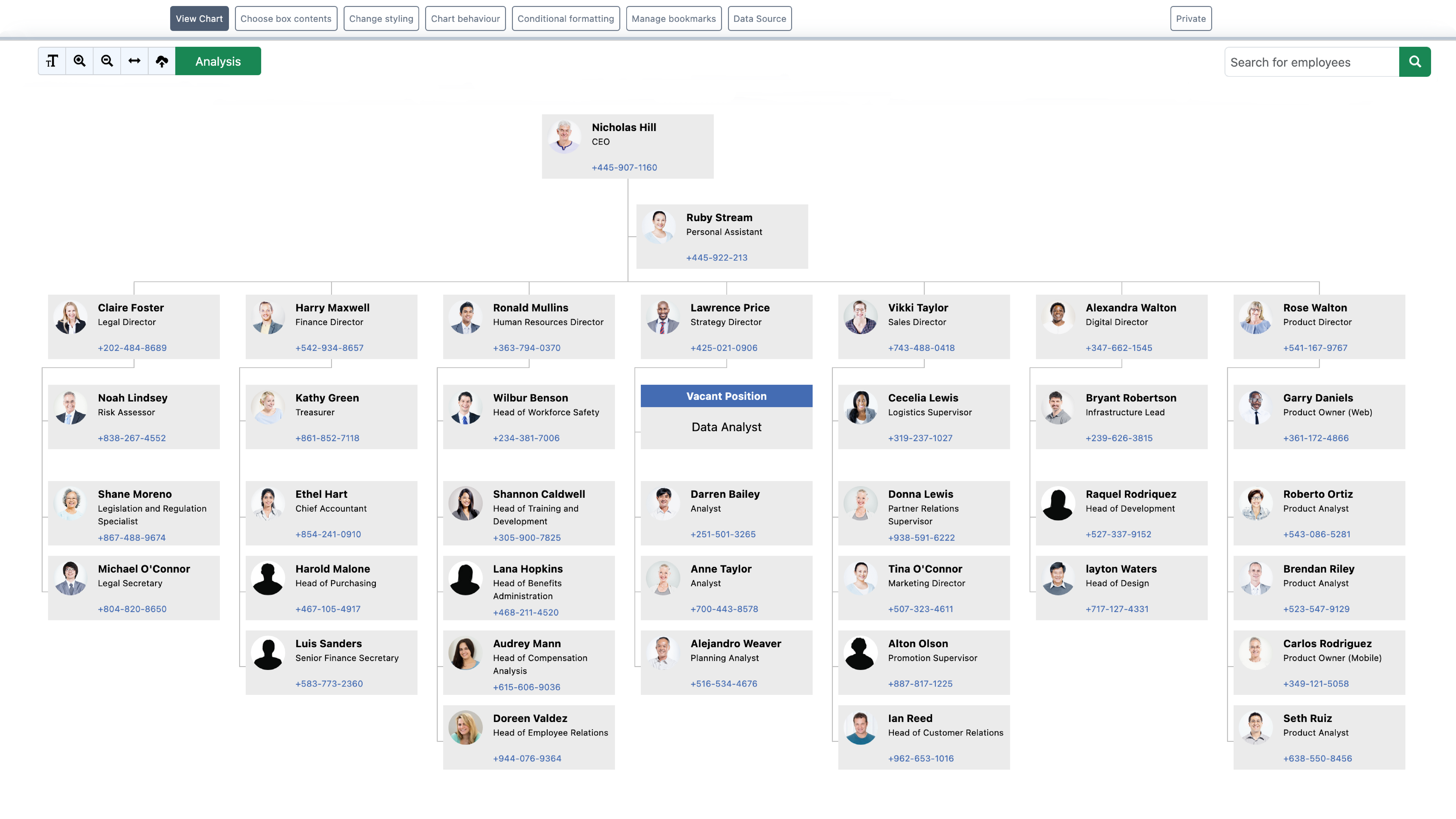
Organization Charts for Microsoft 365, Microsoft Teams & SharePoint.
Integrate with your Microsoft 365 data to visualize and navigate your organization’s structure. Locate and connect with the right people, support collaboration, and empower faster, more informed decision-making.

Get up and running in minutes.
Integrating seamlessly into your Microsoft workflow.


Enhance Collaboration
An accurate org chart clarifies roles and boosts teamwork.
Improve Communication
Clear reporting lines streamline internal messaging.
Accelerate Onboarding
Help new hires integrate faster.
Conditional Formatting
Bring charts to life with dynamic formatting.
Accurate & Dynamic
Create always up-to-date charts from Entra.
Informed Decisions
Maintain accurate data.
Share & Print
Print to PDF, Export to Excel
Benefits for the whole team.
Human Resources
New hires can quickly understand reporting lines and team structures.
Easily visualize vacancies, temporary, and cross-department roles.
Spot and fix incomplete or inaccurate employee information using built-in data analysis tools.
Project Managers
Search by role, location, or any Microsoft Entra ID custom attribute and start a chat or call directly from the directory, no switching apps.
Tailor charts for specific projects, with conditional styles and role-specific filters.
Gain insights into your organisation and have confidence in your data to make quicker, more informed decisions.
IT & System Admins
Create charts from a range of sources including Microsoft Entra ID, SharePoint and Excel.
Reduces administrative overhead while ensuring that sensitive data is only accessible to authorized users.
Uses Microsoft Azure technology stack to provide security and stability services, GDPR compliant.
 Microsoft AppSource