Creating an Org Chart from Excel
TeamOrgChart can create organizational charts from Microsoft Excel. The spreadsheet must contain:
arrow_circle_right
An Id column - a column that uniquely identifies each person.
arrow_circle_right
A Manager column - a column that identifies each individual's manager.
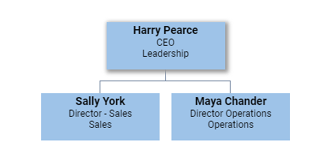
These two columns form the basis for creating the hierarchy, for example, in the sample below the Email column serves as the unique identifier and ManagerEmail references the person's manager. This produces the chart shown below.

Important: The column "types" must match. For example, if you use an email address for the ID, you must use an email address for the Manager.
The other columns in the spreadsheet are used to show data within the organization chart.
Typically, these will include things such as name, job title, department, and telephone number. However, there are no specific requirements. The additional columns can be displayed in the chart boxes, used within conditional rules, and shown in the information pop-up window.
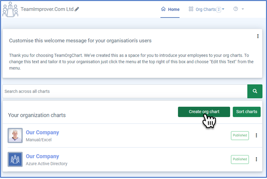
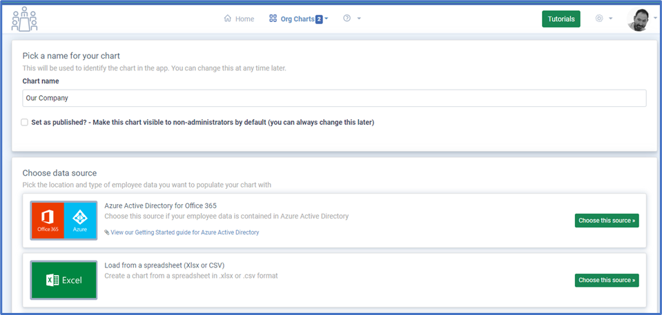
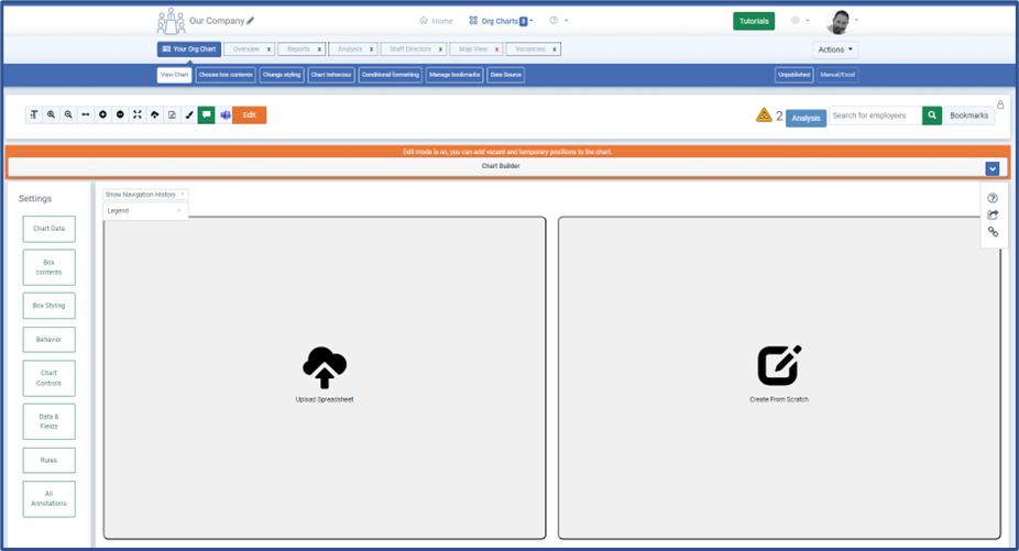
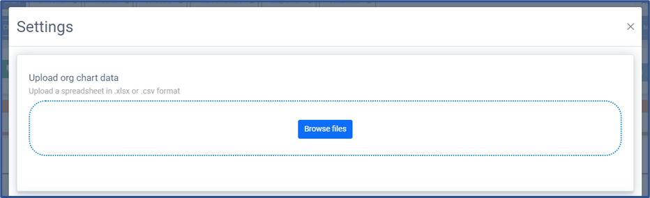
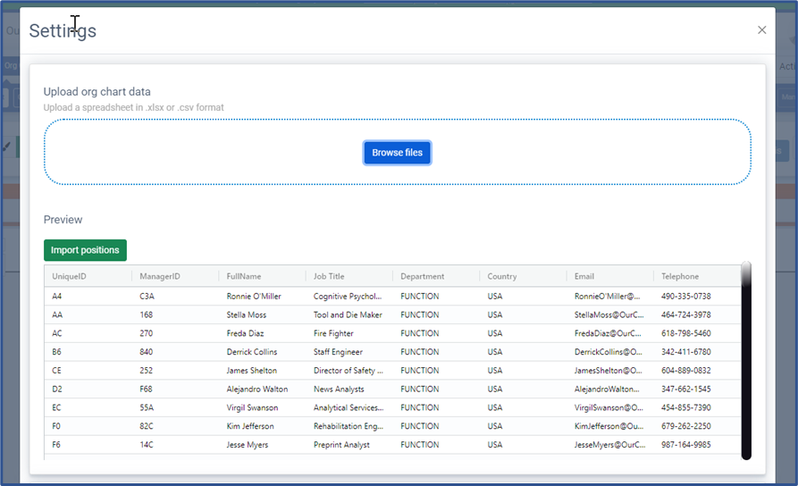
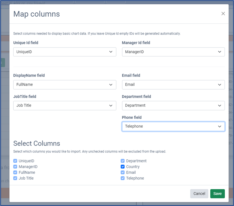
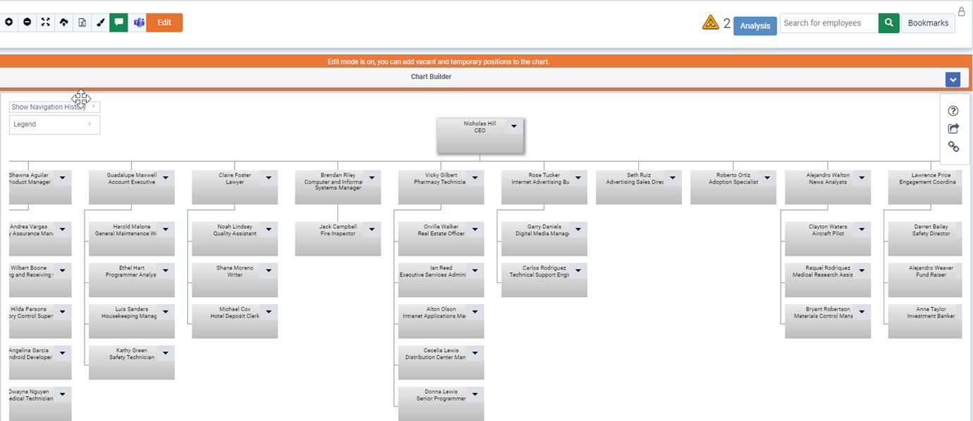
TeamOrgChart will attempt to locate the person at the top of the organization and display the first three levels of the chart starting from their position.
The chart is now ready for further customisation.
Trouble Shooting
When opening the organization chart, a full chart should appear. If you only see a single box, TeamOrgChart may not have been able to connect managers with their direct reports.
This often happens when different data types are used in the unique Id and manager columns, such as an email address for the uniqueId but a name for the manager.
To troubleshoot, go to the Analysis page and run the report. This will validate your data and identify any issues causing the problem.
Recommended Steps
Learn More
Create a chart from Excel(c) TeamImprover.Com